跳至内容
R 绘图合集:ggplot2 常用图表代码速查

R 绘图合集:ggplot2 常用图表代码速查

2024-08-29·Cy257·约 9 分钟读完

常用的 ggplot2 图表代码整理,方便自己以后查阅。每个代码块尽量保持自包含,复制修改数据名就能直接跑。


集合展示

Venn 韦恩图

常用 R 包:

  1. ggVennDiagram:ggplot 风格,出图漂亮
  2. VennDiagram:可提取具体交集情况,适合导出交集列表
  3. Vennerable:支持大小权重展示

ggVennDiagram

1
2
3
4
5
library(ggVennDiagram)

list <- list(E = che$V1, C = che$V2, D = che$V3, S = che$V4)
ggVennDiagram(list, n.sides = 300, lty = 1, color = "white", label = "count") +
  scale_fill_gradient(low = "green", high = "red")

VennDiagram(提取交集)

 1
 2
 3
 4
 5
 6
 7
 8
 9
10
11
12
13
14
library(VennDiagram)

list <- list(E = che$V1, C = che$V2, D = che$V3, S = che$V4)
venn.diagram(list, filename = 'venn4.png', imagetype = 'png',
    fill = c('red', 'blue', 'green', 'orange'), alpha = 0.50,
    cat.col = c('red', 'blue', 'green', 'orange'), cat.cex = 1.5,
    col = c('red', 'blue', 'green', 'orange'), cex = 1.5)

# 提取具体交集元素
inter <- get.venn.partitions(list)
for (i in 1:nrow(inter)) {
  inter[i, 'values'] <- paste(inter[[i, '..values..']], collapse = ', ')
}
write.table(inter[-c(5, 6)], "intersection.xls", quote = F, col.names = T, row.names = F, sep = "\t")

Upset 图

当集合数量超过 4 个时,Venn 图就不太好看了,Upset 图是更好的选择。

 1
 2
 3
 4
 5
 6
 7
 8
 9
10
11
12
13
14
15
16
17
18
19
20
21
22
23
24
25
26
27
library(ComplexHeatmap)
library(UpSetR)

# 从文件列表构造矩阵
getList <- function(file_list) {
  myList <- list()
  for (i in 1:length(file_list[, 1])) {
    tmp <- read.table(file_list[i, 1], header = F, sep = " ")
    name <- basename(file_list[i, 1])
    myList[[name]] <- tmp[, 1]
  }
  return(myList)
}

list <- getList(file)
upset(fromList(list))

# 自定义查询:高亮特定元素
upset(new,
  query.legend = "top",
  queries = list(
    list(query = elements, params = list("ID", che.linc$V1),
         color = "red", active = T, query.name = "che-lincRNA"),
    list(query = elements, params = list("ID", che.NAT$V1),
         color = "green", active = F, query.name = "che-lncNAT")
  )
)

降维聚类

PCA

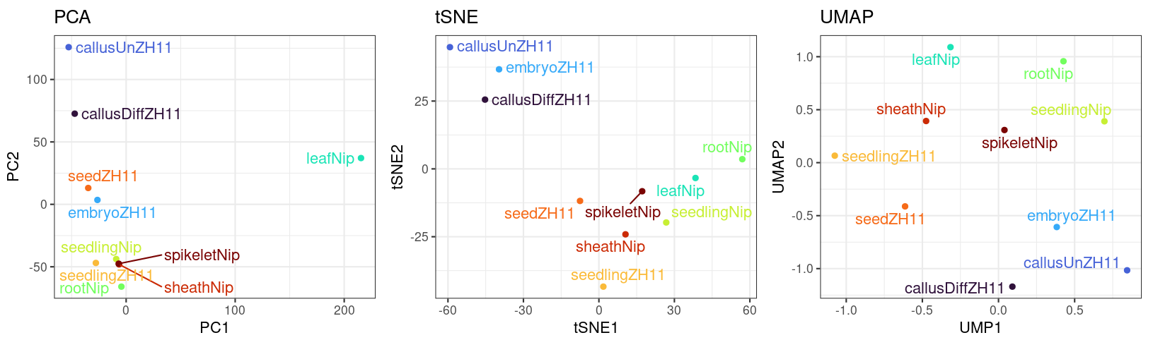
PCA(主成分分析)是最常用的降维可视化方法,可以快速查看样本间的整体差异。

 1
 2
 3
 4
 5
 6
 7
 8
 9
10
11
12
13
14
15
16
17
18
19
20
21
22
23
24
25
26
27
28
29
30
library(ggplot2)
library(ggsci)
library(factoextra)

# 方法 1:使用 factoextra 快速出图
pca <- prcomp(t(all.norm), scale = TRUE)
fviz_pca_ind(pca, col.ind = group_all, mean.point = FALSE,
             addEllipses = TRUE, legend.title = "Groups",
             ellipse.type = "confidence", ellipse.level = 0.95)

# 方法 2:使用 ggplot2 精细控制
pca <- prcomp(t(all.norm), scale = TRUE)
pca.res <- as.data.frame(pca[["x"]])
pca.res$group <- factor(paste(rep(c("E", "C", "D", "S"), each = 4),
                               rep(rep(c(2, 3), each = 2), 4), sep = ""))

# 计算各主成分解释量
pca.var <- as.data.frame(pca$sdev^2)
pca.var$var <- round(pca.var$. / sum(pca.var) * 100, 2)
pca.var$pc <- colnames(pca.res)[1:(ncol(pca.res) - 1)]

ggplot(pca.res, aes(PC1, PC2, color = group, shape = group)) +
  geom_point(size = 3) +
  geom_hline(yintercept = 0, linetype = "dashed") +
  geom_vline(xintercept = 0, linetype = "dashed") +
  scale_color_igv() +
  theme_bw() +
  stat_ellipse(level = 0.95) +
  labs(x = paste0('PC1(', pca.var$var[1], '%)'),
       y = paste0('PC2(', pca.var$var[2], '%)'))

UMAP

 1
 2
 3
 4
 5
 6
 7
 8
 9
10
11
12
library(uwot)
library(ggrepel)
library(ggsci)

resumap <- uwot::umap(t(dat), n_neighbors = 10)
resumap <- as.data.frame(resumap)
resumap$Tissue <- rownames(resumap)

ggplot(resumap, aes(x = V1, y = V2, color = Tissue, label = Tissue)) +
  geom_point() + geom_text_repel() + theme_bw() +
  scale_color_npg() + theme(legend.position = "none") +
  labs(x = "UMAP1", y = "UMAP2", title = "UMAP")

PCA + tSNE + UMAP 整合代码

 1
 2
 3
 4
 5
 6
 7
 8
 9
10
11
12
13
14
15
16
17
18
19
20
21
22
23
24
25
26
27
28
29
30
31
32
33
34
35
36
37
38
39
library(Rtsne)
library(umap)
library(ggsci)
library(patchwork)

plot_PTU <- function(data, group) {
  set.seed(1)

  ## UMAP
  resumap <- as.data.frame(uwot::umap(t(data), n_neighbors = 10))
  resumap$Groups <- group
  p_umap <- ggplot(resumap, aes(x = V1, y = V2, color = Groups)) +
    geom_point() + theme_bw() +
    scale_color_viridis_d(option = "H") +
    theme(legend.position = "none") +
    labs(x = "UMAP1", y = "UMAP2", title = "UMAP")

  ## PCA
  respca <- as.data.frame(stats::prcomp(t(data), scale. = TRUE)$x[, 1:2])
  respca$Groups <- group
  p_pca <- ggplot(respca, aes(x = PC1, y = PC2, color = Groups)) +
    geom_point() + theme_bw() +
    scale_color_viridis_d(option = "H") +
    theme(legend.position = "none") +
    labs(title = "PCA")

  ## tSNE
  perplexity <- round((ncol(data) - 1) / 3) - 1
  restsne <- as.data.frame(Rtsne::Rtsne(t(data), perplexity = perplexity)$Y)
  colnames(restsne) <- c("tSNE1", "tSNE2")
  restsne$Groups <- group
  p_tsne <- ggplot(restsne, aes(x = tSNE1, y = tSNE2, color = Groups)) +
    geom_point() + theme_bw() +
    scale_color_viridis_d(option = "H") +
    theme(legend.position = "none") +
    labs(x = "tSNE1", y = "tSNE2", title = "tSNE")

  p_pca + p_tsne + p_umap
}
PCA / tSNE / UMAP 对比

差异分析

Volcano 火山图

火山图是差异分析结果的标准可视化方式:横轴为 log2 Fold Change,纵轴为 -log10(p-value)。

 1
 2
 3
 4
 5
 6
 7
 8
 9
10
11
12
13
14
# 基础火山图(手动上色)
allDiff$significant <- as.factor(allDiff$adj.P.Val < 0.05 & abs(allDiff$logFC) > 1)

ggplot(data = allDiff, aes(x = logFC, y = -log10(adj.P.Val), color = significant)) +
  geom_point(alpha = 0.8, size = 0.5) +
  ylim(0, 8) +
  scale_color_manual(values = c("black", "red")) +
  geom_hline(yintercept = -log10(0.05), lty = 4, lwd = 0.6, alpha = 0.8) +
  geom_vline(xintercept = c(1, -1), lty = 4, lwd = 0.6, alpha = 0.8) +
  theme_bw() +
  theme(panel.border = element_blank(),
        panel.grid = element_blank(),
        axis.line = element_line(colour = "black")) +
  labs(title = "Volcanoplot", x = "log2 (fold change)", y = "-log10 (padj)")

批量出图函数

 1
 2
 3
 4
 5
 6
 7
 8
 9
10
11
12
13
14
15
Volcano <- function(data, name) {
  p <- ggplot(data, aes(x = log2FoldChange, y = -log10(padj), color = type)) +
    geom_point(alpha = 0.75, size = 1.2) +
    labs(title = name, x = "log2 (fold change)", y = "-log10 (padj)") +
    theme(plot.title = element_text(hjust = 0.4)) +
    geom_hline(yintercept = -log10(0.05), lty = 4, lwd = 0.6, alpha = 0.8) +
    geom_vline(xintercept = c(1, -1), lty = 4, lwd = 0.6, alpha = 0.8) +
    theme_bw() +
    scale_color_manual(values = c("blue", "grey", "red")) +
    xlim(c(-10, 10)) +
    theme(legend.position = c(0.8, 0.8),
          legend.background = element_blank(),
          legend.key = element_blank())
  ggsave(p, filename = paste0(name, "_VolcanoPlot.pdf"), device = "pdf", width = 4, height = 4)
}

柱状图

分组柱状图

1
2
3
4
5
6
ggplot(data = nn) +
  geom_col(aes(x = sample, y = `overall alignment rate`, fill = soft),
           position = "dodge") +
  theme(panel.grid = element_blank(),
        panel.background = element_blank(),
        axis.line = element_line(colour = "black"))

堆叠柱状图 + 冲击图(Alluvial)

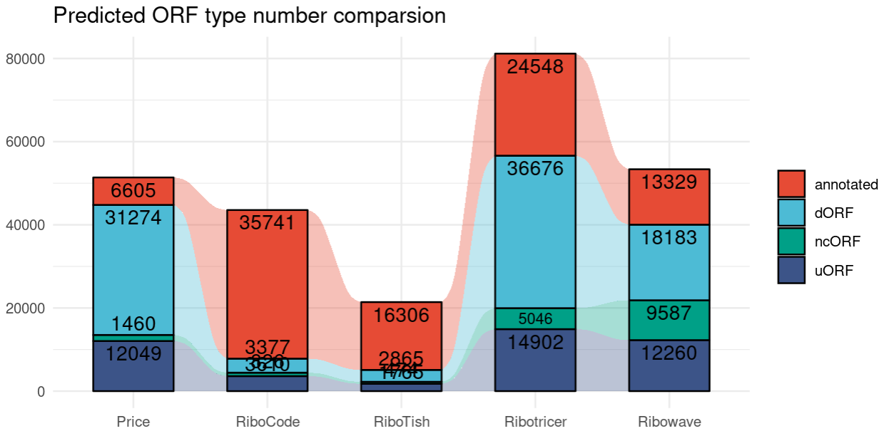
使用 ggalluvial 包将分类数据的流动关系可视化:

 1
 2
 3
 4
 5
 6
 7
 8
 9
10
11
library(ggalluvial)
library(ggfittext)

ggplot(orf_type, aes(V1, V3, alluvium = V2, stratum = V2, label = V3)) +
  geom_alluvium(aes(fill = V2), alpha = 0.5, width = 0.6) +
  geom_stratum(aes(fill = V2), width = 0.6) +
  geom_bar_text(position = "stack", outside = TRUE, contrast = FALSE, place = "top") +
  theme_minimal() +
  scale_fill_npg(alpha = 0.7) +
  labs(x = NULL, y = NULL, title = "Predicted ORF type number comparison") +
  theme(legend.title = element_blank())
堆叠柱状图 + 冲击图

Mean + SD 柱状图

展示均值 ± 标准差,适合生物学重复数据的可视化:

 1
 2
 3
 4
 5
 6
 7
 8
 9
10
11
12
13
14
15
ggplot(exp.L8, aes(x = V3, y = V4, fill = V2)) +
  stat_summary(geom = "col", fun = "mean", width = 0.5) +
  geom_point() +
  stat_summary(fun = mean, geom = "errorbar",
               fun.max = function(x) mean(x) + sd(x),
               fun.min = function(x) mean(x) - sd(x),
               width = 0.3) +
  facet_wrap(~V2) +
  labs(x = NULL, y = "Expression/TPM", title = "L8 lncRNA Expression in ovule") +
  theme_bw() +
  theme(legend.title = element_blank(),
        strip.background = element_blank(),
        panel.grid = element_blank()) +
  scale_fill_aaas(alpha = 0.6)
ggsave("L8_RNA-seq_Exp_in_ovule.pdf", width = 5, height = 2.5)

三元图

三元图(Ternary Plot)常用于展示三个组分之间的比例关系,比如转录本的三种可变剪接类型的占比。

 1
 2
 3
 4
 5
 6
 7
 8
 9
10
library(ggtern)

# 基础三元图
ggtern(test, aes(x, y, z)) + geom_point()

# 带密度等高线
ggtern(test, aes(x, y, z)) +
  geom_point() +
  stat_density_tern(geom = 'polygon', aes(fill = ..level..),
                    bins = 5, color = 'grey', alpha = 0.1)

StreamGraph

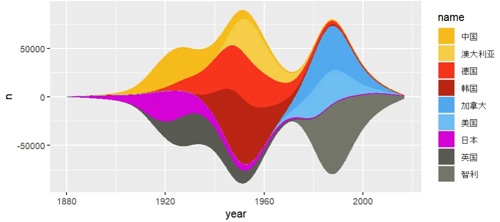
StreamGraph(河流图)适合展示分类数据随时间的变化趋势,面积代表数量。

 1
 2
 3
 4
 5
 6
 7
 8
 9
10
11
12
13
14
15
16
17
18
19
20
library(ggstream)
library(ggplot2)
library(readxl)

data1 <- read_excel("data.xlsx")
data1$name <- factor(data1$name, levels = c("中国", "澳大利亚", "德国", "韩国",
                                             "加拿大", "美国", "日本", "英国", "智利"))
cols <- c("#fab810", "#faca43", "#fa2416", "#be180e",
          "#3cacee", "#5fc0f2", "#d500d5", "#595a52", "#73756a")

ggplot(data1, aes(x = year, y = n, fill = name)) +
  geom_stream(size = 0.25, bw = 0.45, color = "white") +
  scale_fill_manual(values = cols) +
  scale_x_continuous(breaks = seq(1880, 2020, 20)) +
  theme(plot.background = element_rect(fill = "grey88", color = NA),
        panel.background = element_rect(fill = NA, color = NA),
        panel.grid = element_blank(),
        axis.title = element_blank(),
        legend.position = "bottom")
ggsave("streamgraph.pdf", width = 8, height = 4)
StreamGraph 示例

Complex Heatmap

ComplexHeatmap 是绘制复杂热图的首选 R 包,支持多种注释、分面和组合。

批量绘制多组热图

 1
 2
 3
 4
 5
 6
 7
 8
 9
10
11
12
13
14
15
16
17
18
19
20
21
22
23
24
25
26
27
28
29
30
31
32
33
34
35
36
37
38
39
40
41
42
43
44
45
46
47
48
49
50
51
library(ComplexHeatmap)

# 读取输入参数
filepathsList <- read.table(args[1], header = FALSE)[, 1]
groups <- read.table(args[2], header = FALSE)[, 1]
outname <- args[3]

ht_list <- NULL

for (i in 1:length(filepathsList)) {
  filepath <- filepathsList[i]
  dat <- read.table(filepath, header = TRUE, row.names = 1)

  # 按 row 做 z-score 标准化
  dat.scaled <- t(apply(dat, 1, scale))
  rownames(dat.scaled) <- rownames(dat)
  dat.scaled <- na.omit(dat.scaled)  # 去除 NA 和 Inf
  colnames(dat.scaled) <- colnames(dat)

  # 注释
  GOcluster <- unlist(strsplit(basename(filepath), split = "\\."))[2]
  col_anno <- HeatmapAnnotation(groups = groups)
  row_anno <- HeatmapAnnotation(GOcluster = rep(GOcluster, nrow(dat.scaled)), which = "row")

  # 单独热图(显示基因名)
  p_single <- Heatmap(dat.scaled, cluster_rows = TRUE,
                      show_column_names = TRUE, show_row_names = TRUE,
                      cluster_columns = FALSE, column_names_rot = 45,
                      top_annotation = col_anno, left_annotation = row_anno,
                      name = "Expr. z-score",
                      row_names_gp = gpar(fontsize = 6),
                      col = c("#3171AC", "#FFFFFF", "#D25536"))
  pdf(paste0(outname, "_", GOcluster, "_Single.pdf"), height = 12, width = 12)
  draw(p_single)
  dev.off()

  # 合并热图(隐藏基因名)
  p <- Heatmap(dat.scaled, cluster_rows = TRUE,
               show_column_names = TRUE, show_row_names = FALSE,
               cluster_columns = FALSE, column_names_rot = 45,
               top_annotation = if (i == 1) col_anno else NULL,
               left_annotation = row_anno,
               name = "Expr. z-score",
               col = c("#3171AC", "#FFFFFF", "#D25536"))
  ht_list <- ht_list %v% p
}

# 输出合并热图
pdf(paste0(outname, "_Multi_Heatmap.pdf"), height = 12, width = 12)
draw(ht_list)
dev.off()

提取聚类结果

绘制热图后,经常需要提取每个 cluster 中的基因列表做后续分析。

 1
 2
 3
 4
 5
 6
 7
 8
 9
10
11
12
13
14
# 通用函数:从 Heatmap 对象中提取聚类结果
ExtractCluster <- function(HM, mat) {
  clusters <- lapply(seq_along(row_order(HM)), function(i) {
    genes <- rownames(mat)[row_order(HM)[[i]]]
    data.frame(GeneID = genes, Cluster = paste0("cluster", i), stringsAsFactors = FALSE)
  })
  do.call(rbind, clusters)
}

# 使用示例
hm <- Heatmap(mat, row_km = 3)  # k-means 分 3 类
HM <- draw(hm)
clusters <- ExtractCluster(HM, mat)
print(head(clusters))

参数说明

  • HMdraw() 后返回的 Heatmap 对象
  • mat:原始表达矩阵,行名为基因名
  • 输出为 data.frame,包含 GeneIDCluster 两列

小结

图表类型R 包适用场景
VennggVennDiagram / VennDiagram展示集合交集
UpsetUpSetR多集合(>4)交集可视化
PCAggplot2 + factoextra样本降维聚类
tSNE / UMAPRtsne / uwot非线性降维
Volcanoggplot2差异分析结果展示
柱状图ggplot2数值比较
Alluvialggalluvial分类数据流动
三元图ggtern三组分比例
StreamGraphggstream时序分类趋势
ComplexHeatmapComplexHeatmap表达热图 + 聚类
最后更新于